
Monday, 4 November 2013

Sunday, 3 November 2013
Exploring Themes for Summertime Madness- Theme blends/edits.
Exploring background theme- Theme blends.
I feel that the best idea to create a simple yet detailed effect for the background theme to my magazine was to blend both ideas of flowers for the feminine side of the magazine and light blurs, the blurs is to create a shuttle and a calm atmosphere as its only the background of the magazine. I feel if the background to my front cover and theme is shuttle it makes the magazine seem more outgoing as the articles and information stands out against the plain background. I feel the images will be just what my audience want therefore will work well in promoting the magazine as the information on the title page looks overly exciting and outgoing. Below are the my own images i have taken and blended together to create this effect, i overlay-ed the image of the flower on top of the image of the lights.


Exploring themes for Summertime Madness- Theme pictures
Exploring themes- Blurred lights and flowers.
To explore theses themes i decided to explore the theme through my own photography. The theme i wanted to create within theses images is a soft shuttle girly theme as the end image i will produce will just be the background of the magazine so needs to be kept simple and plain as its there for design and must not draw attention away from the main articles and images as that may be a problem for buyers.

To explore the theme of blurred lights i took tree lights which were a plain white color and set up my digital camera in a dark room. The camera needed to be set up to allow minimum amount of light through the lens, this will reduce the central focus on the object (the light bulbs) as little light is passed through. The camera should adjust itself so the lights emitted from the light bulbs form a blurred round shape. I studied the angles of the lights and tried to aloud more circles of light into the frame this was to create the warm theme i wanted for my magazine.


To explore theses themes i decided to explore the theme through my own photography. The theme i wanted to create within theses images is a soft shuttle girly theme as the end image i will produce will just be the background of the magazine so needs to be kept simple and plain as its there for design and must not draw attention away from the main articles and images as that may be a problem for buyers.

To explore the theme of blurred lights i took tree lights which were a plain white color and set up my digital camera in a dark room. The camera needed to be set up to allow minimum amount of light through the lens, this will reduce the central focus on the object (the light bulbs) as little light is passed through. The camera should adjust itself so the lights emitted from the light bulbs form a blurred round shape. I studied the angles of the lights and tried to aloud more circles of light into the frame this was to create the warm theme i wanted for my magazine.

I felt happy with the outcome of my picture, Theses were the basic picture without being edited. Once edited the picture will give across the warm inviting atmosphere i wanted to go for within my magazines theme.Ill need to chose the lightest images within the set to get the best outcome, the light my image the more chance the image will look warm and shuttle. If i chose an image with less light circles but more dark contrast they would be harder to edit and will create a dark photo which is not the theme i'm aiming for.
To explore the theme of flowers, i used my digital camera and went out and took photos of flowers at my local garden center . I tried to explore flower which had light shades of colors and basic shapes. I didn't want to many photographs of flowers which were too complicated or had brightly colored petals but i felt the colors in the petals will stand out better when blended with the light.I felt light colors was most appropriate for my theme as light pretty colors are more feminine than more harsher colors like blacks and reds. Below are the images of the flowers that i took, i felt it was better to take group pictures as they would blend in better against the light than to have single shots alone.

Exploring Themes For My Magazine- Summertime Madness
Exploring themes behind the magazine - Summertime Madness.
The theme here is a shuttle theme, This theme will create a plain yet atmospheric effect.The blur within the images will make all writing and images a focus as the theme is needed as a background theme and its not to be overly distracting. The theme links into the magazine by contrasting a relaxed effect through out the magazine, the theme is bubbly but not too 'in your face' which is what my target audience will want and they will need a theme witch screams 'summer'. The flower theme through out the magazine will bring a relaxed yet girly atmosphere. The theme i prefer is the flower theme i will take my own images to cross both themes, so i use both aspects of the images creating the perfect tone and theme to my magazine.
 Theme two: Exploring summer inside. Summer colors are reds and yellows theses colors are bold yet collide therefore would make the front page of my magazine stand out. This theme represents summer inside

The theme here is a shuttle theme, This theme will create a plain yet atmospheric effect.The blur within the images will make all writing and images a focus as the theme is needed as a background theme and its not to be overly distracting. The theme links into the magazine by contrasting a relaxed effect through out the magazine, the theme is bubbly but not too 'in your face' which is what my target audience will want and they will need a theme witch screams 'summer'. The flower theme through out the magazine will bring a relaxed yet girly atmosphere. The theme i prefer is the flower theme i will take my own images to cross both themes, so i use both aspects of the images creating the perfect tone and theme to my magazine.


Final Name Ideas (summertime madness, flowers and fest, shout)
Summertime Madness.
The title 'summertime madness' straight away gives the reader the impression of what the magazine is based on which is summertime and festivals. The word summer stands out in the title and makes the magazine more sell-able in the summer session, the word time in the 'summertime' suggests the magazine is aimed at a certain period of time for example summer. The audience will be drawn in by the warm word of summer and then attracted to the word madness the word madness contrasts against the word summertime making both words clash and stand out as a title. The title is introducing summer and madness which is what my audience want from the magazine as the magazine is targeted at festival goers and festival session is in summer therefore i feel this title fits perfectly with the category of the magazine. It will appeal to the audience and it relates to the contents through style and contrast of words. My target audience will want a magazine that shows and expresses festival madness.
.jpg)


The title 'summertime madness' straight away gives the reader the impression of what the magazine is based on which is summertime and festivals. The word summer stands out in the title and makes the magazine more sell-able in the summer session, the word time in the 'summertime' suggests the magazine is aimed at a certain period of time for example summer. The audience will be drawn in by the warm word of summer and then attracted to the word madness the word madness contrasts against the word summertime making both words clash and stand out as a title. The title is introducing summer and madness which is what my audience want from the magazine as the magazine is targeted at festival goers and festival session is in summer therefore i feel this title fits perfectly with the category of the magazine. It will appeal to the audience and it relates to the contents through style and contrast of words. My target audience will want a magazine that shows and expresses festival madness.
.jpg)
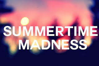
I feel the font 'SUMMERTIME MADNESS' in the image above is a good way to express the title. The font is bold and by the use of capital letters it emphases the strong atmosphere that festivals have. The use of the color white against the blurred background makes the title readable yet fun, the title blends into the image which relates to the idea of being 'lost in a crowd'. I feel the example of the title above could be good strong title to have on the front of my magazine as i feel it has an atmospheric effect that will relate to my audience.
Flowers and Fest.
This title promotes the magazine as a fun time girly magazine This relates to my target audience as they will be girls ages 17-25 who go to festivals. The word 'Flowers' promotes the girly side of the magazine, flowers are soft and create a feminine atmosphere. My target audience will be girly festival ladies and will want a music magazine that promotes fashion along side artist promotion. The word 'and fest' shows that the magazine is about festivals and its relates to the word flowers. The magazine will promote fashion through the use of 'flower' but also promotes the music side of the magazine but the use of the word fest. Therefore i feel this title works well to promote festivals to girls.

The soft gentle flowers will promote a warm inviting feeling to the introduction of the magazine, if the title links to flowers it could create a theme for throughout the magazine. The title font used for this title 'Flowers and Fest' would need to contrast, the word Flowers would be in italics 'Flowers' to create the soft warm feeling inviting the reader into the magazine and word fest would need to stand out to emphasis the meaning of the music magazine and relate to the theme. The word fest would need to be bold and use of capital letters would make words contrast against one another 'FEST'.
SHOUT.
The title here is simple yet to the point. For this one i wanted to create a title that's bold yet effective. This title will be what the target audience want as its direct and easy for young adults to read. The title creates a buzz to the magazine giving off the festival atmosphere. The word 'shout' relates directly to festivals as shouting is pronounced often at festivals, the word shout would be in a clear font to inform the readers of the theme and what the magazine has to offer.

The image here it shown in a funky font. The font shows how atmospheric the magazine is and creates an effect that the target audience wants to read. The image of the mouth on the center of the 'O' creates a different effect to the others making the title stand out.
Subscribe to:
Posts (Atom)