Thursday, 14 November 2013

Online drafts of summertime Madness-Front Cover and contents page.

Drafts for Summertime Madness:
Front cover- The front cover is the main page to the magazine so needs to appear bold and use unique techniques to stand out against other magazines on the market. I have used colors that are linked to summer for my theme and text. I feel the overall layout of this draft is the layout id like to stick to, however i want to experiment with indoor photo shoots so may change the color scheme to reds and yellows to give off an indoor summer atmosphere.
Contents page: For my contents page i kept to the theme of summer as i wanted to keep the theme running throughout the magazine, This was done by using light colors because the photos i used here are drafts off the internet but were taken outside so a light color scheme was needed where as my photo shoot i want to experiment with indoor lighting so i would change the font color to suit the photos. However i will stick to the same layout and text of this contents page as i like the feel of the magazine.

Monday, 11 November 2013

Planning of Phootshoot- Summertime Madness.


The photo shoot.
Due to the style of the artist the photos will need to promote her and the style of music she produces. The best location to suit both  magazine and artist would ideally need to be outside  within an old setting or  against an urban background such as a wall or against a bill board this will promote an indie atmosphere without taking the attention off  the main artist. The urban background  will bring out the artists personality and music style along  side the chosen outfit to present her in an urban way.

Planning of photo shoot:  The photo shoot will need to be an efficient yet effective process as the image is the main feature of the cover of my magazine, therefore both artist and magazine producer need to be happy with the image.

The magazine producer:  The producer needs to edit  the images  to present and relate to the urban indie festival theme of the magazine. The producer must edit the photos in a way so the  main image relates to the house style this can be done by playing with  the effects on the photo or even the colour levels. By adjusting the effects on the photos the image can be inviting and  therefore makes the magazine more sellable therefore the producer  has  a curtail part within the production of the magazine.
ARTIST IMAGE. The feature artist look:
Hair:  Messy, wind swept look. Completely  down. The hair needs to look festival like as if the artist has been at a festival all weekend. The look i want to promote is messy wavy. I will need to use straighteners to dived the hair then a back combing brush to identify volume within the hair. The hair should be detailed with hair spray for a firm hold.


Make up: Natural look but with a sense of stage make up to brighten up the artists key features. Makeup is important to make sure that the artist looks good as the artist is effectively promoting the magazine. The make up i will use is a base foundation for cover up of any uneven skin colors and then ill apply a powered over the top this will hid any uneven skin tones. The artist will have soft eye shadow to promote summer and then eyeliner will be applied over the top to promote the style of her music. 


Dress:  The artists dress senses needs to represent her style of music, the artist needs to present her style of music through dress as its a representation of the magazine style and her music. Below is what my feature artist will be wearing for her photo shoot. Torn ripped light blue jeans are from miss selfridge they price at £17.99, Leather jacket, Topshop prices at £89.99, Black heels top shop price at £22.99.


Shoot:  Natural looking  poses walking through  fields or against a brick wall. The fields shoots will be better as they create more of a festival atmosphere which is represented to the magazine. The field will need to be atmospheric for a more drawing into the magazine pattern  


Or inside summer theme, This could be taken in a studio or against a backdrop. If the images were taken inside then the attention for the front cover would be focused on the model and what shes wearing will give off the summer rock vibes. I should use light colors such as yellows and reds to create a summer atmosphere. I could also play with the lighting around the shoot to gives detail to my photographs. 


Ideas for my photo shoot- Summertime Madness

Model: Ivy willows
Age: 19 years old
Gendar: Female
Artists music genre: Urban indie
Artists best friend: Jake Bug
Individuals fashion sense: Indie
Individuals Favorite shop: Topshop, Urban outfitters, Aubin&wills
Favorite artist to perform with: Arctic monkeys
Favorite festival performed at: Reading&Leeds
Number of records sold: 234,000

Friday, 8 November 2013

Feature artists planning- Summertime Madness


Feature Artist Planning-Summertime Madness


Jason Oakley- Jason is a single solo artist. He was brought up within the music industry as his father was a music producer. This meant jason was constantly meeting music artists and was inspired by them to get big in the music industry.Jason is 21 so is young for an artist. He has an urban fashion sense and is into holister and jackwills, jason is from a British wealthy background.

Forever Young- Forever young is a band of three, two boys tom and jack and a girl cassie. The band was created through a group of friends wanting to make it big. The band often does gigs in londons bars and pubs but has recently moved to festivals. The band all come from london and are all big festival goers therefore know alot about the background of festivals. The band all have a similar taste in music and fashion the band are in the age range of 18-21. This is young for a succesful band hence why they called them self 'forever young'. Forever young produce indie music.

KTAG- KTAG are a band of two boys Konnor and Jay. The band produce urban rap music. KTAG have been a successful band because of the twist they have to there music by introducing rap to urban. The band were put together by a music producer at auditions for the voice.The band made it through to the semi finals. The band now currently play at festivals and small concerts.The band have a topshop/ urban outfitters style.  

House style- Exploring magazine logos.

The magazines themed Logo.
The magazine needs a themed logo to create an soreal atmosphere to the magazine. The logo will need to be inventive so its easily reckonisable and therefore people wil notice the lable when its advertised on certain magazines this will be a unique selling point to the magazine. Below are a few designs for a logo:
Below is the magazine logo I've decided to go for:
I feel this logo creates atmosphere for the magazine.I feel it will represent the magazines image well as it presents what the magazine is all about. The logo will be remember as it shows both summertime and people jumping which could suggest 'Madness', This makes the logo recognizable.

Sunday, 3 November 2013

Exploring Themes for Summertime Madness- Theme blends/edits.

Exploring background theme- Theme blends.
I feel that the best idea to create a simple yet detailed effect for the background theme to my magazine was to blend both ideas of flowers for the feminine side of the magazine and light blurs, the blurs is to create a shuttle and a calm atmosphere as its only the background of the magazine. I feel if the background to my front cover and theme is shuttle it makes the magazine seem more outgoing as the articles and information stands out against the plain background. I feel the images will be just what my audience want therefore will work well in promoting the magazine as the information on the title page looks overly exciting and outgoing. Below are the my own images i have taken and blended together to create this effect, i overlay-ed the image of the flower on top of the image of the lights.

Exploring themes for Summertime Madness- Theme pictures

Exploring themes- Blurred lights and flowers.
To explore theses themes i decided to explore the theme through my own photography. The theme i wanted to create within theses images is a soft shuttle girly theme as the end image i will produce will just be the background of the magazine so needs to be kept simple and plain as its there for design and must not draw attention away from the main articles and images as that may be a problem for buyers.

To explore the theme of blurred lights i took tree lights which were a plain white color and set up my digital camera in a dark room. The camera needed to be set up to allow minimum amount of light through the lens, this will reduce the central focus on the object (the light bulbs) as little light is passed through. The camera should adjust itself so the lights emitted from the light bulbs form a blurred round shape. I studied the angles of the lights and tried to aloud more circles of light into the frame this was to create the warm theme i wanted for my magazine.   
I felt happy with the outcome of my picture, Theses were the basic picture without being edited. Once edited the picture will give across the warm inviting atmosphere i wanted to go for within my magazines theme.Ill need to chose the lightest images within the set to get the best outcome, the light my image the more chance the image will look warm and shuttle. If i chose an image with less light circles but more dark contrast they would be harder to edit and will create a dark photo which is not the theme i'm aiming for. 


To explore the theme of flowers, i used my digital camera and went out and took photos of flowers at my local garden center . I tried to explore flower which had light shades of colors and basic shapes. I didn't want to many photographs of flowers which were too complicated or had brightly colored petals but i felt the colors in the petals will stand out better when blended with the light.I felt light colors was most appropriate for my theme as light pretty colors are more feminine than more harsher colors like blacks and reds. Below are the images of the flowers that i took, i felt it was better to take group pictures as they would blend in better against the light than to have single shots alone.


Exploring Themes For My Magazine- Summertime Madness

 Exploring themes behind the magazine - Summertime Madness.                                    
 The theme here is a shuttle theme, This theme will create a plain yet atmospheric effect.The blur within the images will make all writing and images a focus as the theme is needed as a background theme and its not to be overly distracting. The theme links into the magazine by contrasting a relaxed effect through out the magazine, the theme is bubbly but not too 'in your face' which is what my target audience will want and they will need a theme witch screams 'summer'.  The flower theme through out the magazine will bring a relaxed yet girly atmosphere. The theme i prefer is the flower theme i will take my own images to cross both themes, so i use both aspects of the images creating the perfect tone and theme to my magazine. 
Theme two: Exploring summer inside. Summer colors are reds and yellows theses colors are bold yet collide therefore would make the front page of my magazine stand out. This theme represents summer inside


Exploring fonts for Summertime Madness.


Chosen Magazine Name- Summertime Madness


Final Name Ideas (summertime madness, flowers and fest, shout)

Summertime Madness.
The title 'summertime madness' straight away gives the reader the impression of what the magazine is based on which is summertime and festivals. The word summer stands out in the title and makes the magazine more sell-able in the summer session, the word time in the 'summertime' suggests the magazine is aimed at a certain period of time for example summer. The audience will be drawn in by the warm word of summer and then attracted to the word madness the word madness contrasts against the word summertime making both words clash and stand out as a title. The title is introducing summer and madness which is what my audience want from the magazine as the magazine is targeted at festival goers and festival session is in summer therefore i feel this title fits perfectly with the category of the magazine. It will appeal to the audience  and it relates to the contents through style and contrast of words. My target audience will want a magazine that shows and expresses festival madness.
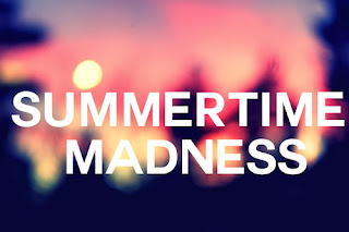
I feel the font 'SUMMERTIME MADNESS' in the image above is a good way to express the title. The font is bold and by the use of capital letters it emphases the strong atmosphere that festivals have. The use of the color white against the blurred background makes the title readable yet fun, the title blends into the image which relates to the idea of being 'lost in a crowd'. I feel the example of the title above could be good strong title to have on the front of my magazine as i feel it has an atmospheric effect that will relate to my audience.

Flowers and Fest.
This title promotes the magazine as a fun time girly magazine  This relates to my target audience as they will be girls ages 17-25 who go to festivals. The word 'Flowers' promotes the girly side of the magazine, flowers are soft and create a feminine atmosphere. My target audience will be girly festival ladies and will want a music magazine that promotes fashion along side artist promotion. The word 'and fest' shows that the magazine is about festivals and its relates to the word flowers. The magazine will promote fashion through the use of 'flower' but also promotes the music side of the magazine but the use of the word fest. Therefore i feel this title works well to promote festivals to girls.

The soft gentle flowers will promote a warm inviting feeling to the introduction of the magazine, if the title links to flowers it could create a theme for throughout the magazine. The title font used for this title 'Flowers and Fest' would need to contrast, the word Flowers would be in italics 'Flowers' to create the soft warm feeling inviting the reader into the magazine and word fest would need to stand out to emphasis the meaning of the music magazine and relate to the theme. The word fest would need to be bold and use of capital letters would make words contrast against one another 'FEST'.  
SHOUT.
The title here is simple yet to the point. For this one i wanted to create a title that's bold yet effective. This title will be what the target audience want as its direct and easy for young adults to read. The title creates a buzz to the magazine giving off the festival atmosphere. The word 'shout' relates directly to festivals as shouting is pronounced often at festivals, the word shout would be in a clear font to inform the readers of the theme and what the magazine has to offer.
The image here it shown in a funky font. The font shows how atmospheric the magazine is and creates an effect that the target audience wants to read. The image of the mouth on the center of the 'O' creates a different effect to the others making the title stand out.