Monday, 16 September 2013
Friday, 13 September 2013
Planning of Magazine.
Problem page for a sixform Magazine.
Target audience: The target audience for this article will be 16-18 year old sixform students. The article will have to take into consideration students interests and hobbies if the article is successful it will need to be exciting and interesting for students. The magazine will need to research into different gender interests and personalities to fill the problem page with interesting story's that the students can relate too.
Magazines Name: Due to the fact the target audience is old teenagers the magazine will need to have a bold effective title that stands out against other magazines. My thoughts on the title is to make it as bright and as clear as possible. The name needs to be catching and maybe by interpreting humour into the title it will give it an effective outcome.
List of magazine names-
My Brain 'The funniest exam magazine to date'
Student Life ' How to be the perfect student'
Sixform Herald
 Slogan: The sixform magazine is aimed at the students of the downs specifically therefore the slogan should be the downs school logo as my magazine is not aimed at students as a whole.
Colour scheme: By interpreting the school logo colours it relates the slogan to context. The colours yellow and red could be interpreted as clown colours therefore would make the magazine look fun, Due to the colour being bright it would draw the viewers eyes to the magazine the yellow interpreted into the theme is seen as an inviting warm colour making the viewer feel comfort by the magazine. The house style colours will continue throughout the magazine.
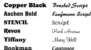
Font: The font in my magazine will need to link in with the house style of fun. The font needs to be clear and effective below are some fonts i feel will relate to my magazine.
Fonts
The fonts important throughout your magazine so therefore needs to chosen with precision.
Target audience: The target audience for this article will be 16-18 year old sixform students. The article will have to take into consideration students interests and hobbies if the article is successful it will need to be exciting and interesting for students. The magazine will need to research into different gender interests and personalities to fill the problem page with interesting story's that the students can relate too.
Magazines Name: Due to the fact the target audience is old teenagers the magazine will need to have a bold effective title that stands out against other magazines. My thoughts on the title is to make it as bright and as clear as possible. The name needs to be catching and maybe by interpreting humour into the title it will give it an effective outcome.
List of magazine names-
My Brain 'The funniest exam magazine to date'
Student Life ' How to be the perfect student'
Sixform Herald
 Slogan: The sixform magazine is aimed at the students of the downs specifically therefore the slogan should be the downs school logo as my magazine is not aimed at students as a whole.
Colour scheme: By interpreting the school logo colours it relates the slogan to context. The colours yellow and red could be interpreted as clown colours therefore would make the magazine look fun, Due to the colour being bright it would draw the viewers eyes to the magazine the yellow interpreted into the theme is seen as an inviting warm colour making the viewer feel comfort by the magazine. The house style colours will continue throughout the magazine.
Font: The font in my magazine will need to link in with the house style of fun. The font needs to be clear and effective below are some fonts i feel will relate to my magazine.
Fonts
The fonts important throughout your magazine so therefore needs to chosen with precision.
Monday, 9 September 2013
Review on conventions and style features of three problem pages.
AS Media- Preliminary Project. 09.09.2013
- The three magazines are all aimed at females this is shown in the style feature by use of the colour pink making the magazines appear feminine. The use of soft colours gives the magazines a warm and inviting effect, making them appear comforting almost as if the reader can feel comfort by the magazine inviting the target audience of females to buy the magazine.
- Another style feature the magazines have in common is the fact they all pursue an italics type master head this will attract female attention as it is seen as feminine.Italics also stands out against other fonts.
- A convention the magazines share is use of light colour schemes mainly pale pinks and blues.
- Additionally the magazines all contain a central image.
- All magazines share a connections and link in with an guidance page this is commonly known as an 'agony aunt'
- The magazines have good use of subheadings and quotes, this is used to draw attention of the target audience making them want to read the article/story.
- The layout of the pages are focused on box's and borders making the articles look indepth and interesting.
- The use of drop caps within the magazines create an engaging effect.
- Another style feature the magazines all pursue is use of additional images that relate to the article.
Subscribe to:
Comments (Atom)

.jpeg)

