
Monday, 16 December 2013
Feature article planning- Ivy willows
Excitment is in the air as Ivy willows debut ablum date set for spring 2014.
QUOTES with pictures.
'Ivy is blooming, considdering shes a new artist in the music industry and were all very proud of her' states june willows ivys mum.
'My voice is the top thing. That's the key'
'I felt a pull towards electronic music': Ivy Willows photographed at her home in west London last week. Photograph: Jade Neville for the Observer
Solo singer ivy willows has announced her debut album 'stronger' which is set to be released in march 2014. The singer has recently released her single 'shades' which was very popular and is currently fourth in the charts.For female singer-songwriters, revenge is an album best served platinum. Just ask Jessie J, whose split-inspired record 'wild' earned seven Grammy Award—not to mention worldwide praise.Thankfully, while there's no bad blood between pop-star Ivy Willows and BBC Radio 1 DJ Greg James, willows sophomore new album, stronger still manages to tug on all the right heartstrings.
Ivy is small with shiney brown hair and walks around the flat in a baggy T-shirt and big pyjama bottoms . After a quick scurry around to check that her hair was fixed we settle on sofas in the living room, next to a Brit award she won in 2011 for her ablum 'brown'. It smells of burning," Ivy added promotoly. "Why does it smell of buring? I haven't cooked in weeks." the singer adds as she laughs. After the amounted of interviews ive been to i tell her not to worry to much about burning food after all that's what take outs are for. Willows snorts.
For Ivy, it's been a scary, windy journey to this point in her life. Willows success has not come easily after being brought up in a small village in the north of Devon Ivy had to fight for her place in the music industry.Growing up ivy has always been the intelligent sort, she flew through high school and studied music alongside drama and dance for alevels. After alevels instead of going to uni willows took a break, she wanted to be successful in the music industry and felt being young was the way forward into the carrer. Ivy packed her bags and went to london, ivy adds 'This was the best thing i could have done, there was no way i could have got as far as i am now if i stayed in that country village'. Ivy went around small pubs in the back streets of London trying to promote her voice, 'My voice is the top thing. That's the key' she adds. Ivy spent 18 months in london when she got used to london life she finally got recognised by a scouter in a bar in south london. The scouter was the begining of ivys journey.
Thursday, 14 November 2013
Online drafts of summertime Madness-Front Cover and contents page.
Drafts for Summertime Madness:
Front cover- The front cover is the main page to the magazine so needs to appear bold and use unique techniques to stand out against other magazines on the market. I have used colors that are linked to summer for my theme and text. I feel the overall layout of this draft is the layout id like to stick to, however i want to experiment with indoor photo shoots so may change the color scheme to reds and yellows to give off an indoor summer atmosphere.

 Contents page: For my contents page i kept to the theme of summer as i wanted to keep the theme running throughout the magazine, This was done by using light colors because the photos i used here are drafts off the internet but were taken outside so a light color scheme was needed where as my photo shoot i want to experiment with indoor lighting so i would change the font color to suit the photos. However i will stick to the same layout and text of this contents page as i like the feel of the magazine.
Contents page: For my contents page i kept to the theme of summer as i wanted to keep the theme running throughout the magazine, This was done by using light colors because the photos i used here are drafts off the internet but were taken outside so a light color scheme was needed where as my photo shoot i want to experiment with indoor lighting so i would change the font color to suit the photos. However i will stick to the same layout and text of this contents page as i like the feel of the magazine.Monday, 11 November 2013
Planning of Phootshoot- Summertime Madness.
The photo shoot.
Due
to the style of the artist the photos will need to promote her and the style of
music she produces. The best location to suit both magazine and artist would ideally need to be
outside within an old setting or against an urban background such as a wall or
against a bill board this will promote an indie atmosphere without taking the
attention off the main artist. The urban
background will bring out the artists
personality and music style along side
the chosen outfit to present her in an urban way.
Planning of photo shoot: The photo shoot will need to be an
efficient yet effective process as the image is the main feature of the cover
of my magazine, therefore both artist and magazine producer need to be happy
with the image.
The magazine producer: The producer needs to edit the images
to present and relate to the urban indie festival theme of the magazine.
The producer must edit the photos in a way so the main image relates to the house style this
can be done by playing with the effects
on the photo or even the colour levels. By adjusting the effects on the photos
the image can be inviting and therefore
makes the magazine more sellable therefore the producer has a
curtail part within the production of the magazine.
ARTIST IMAGE. The feature artist look:
Hair: Messy, wind swept look. Completely down. The hair needs to look festival like as if the artist has been at a festival all weekend. The look i want to promote is messy wavy. I will need to use straighteners to dived the hair then a back combing brush to identify volume within the hair. The hair should be detailed with hair spray for a firm hold.

Make up: Natural look but with a sense of stage make up to brighten up the artists key features. Makeup is important to make sure that the artist looks good as the artist is effectively promoting the magazine. The make up i will use is a base foundation for cover up of any uneven skin colors and then ill apply a powered over the top this will hid any uneven skin tones. The artist will have soft eye shadow to promote summer and then eyeliner will be applied over the top to promote the style of her music.

Make up: Natural look but with a sense of stage make up to brighten up the artists key features. Makeup is important to make sure that the artist looks good as the artist is effectively promoting the magazine. The make up i will use is a base foundation for cover up of any uneven skin colors and then ill apply a powered over the top this will hid any uneven skin tones. The artist will have soft eye shadow to promote summer and then eyeliner will be applied over the top to promote the style of her music.
.jpg)
Dress: The artists dress senses needs to represent her style of music, the artist needs to present her style of music through dress as its a representation of the magazine style and her music. Below is what my feature artist will be wearing for her photo shoot. Torn ripped light blue jeans are from miss selfridge they price at £17.99, Leather jacket, Topshop prices at £89.99, Black heels top shop price at £22.99.

Shoot: Natural looking poses walking through fields or against a brick wall. The fields shoots will be better as they create more of a festival atmosphere which is represented to the magazine. The field will need to be atmospheric for a more drawing into the magazine pattern
 Or inside summer theme, This could be taken in a studio or against a backdrop. If the images were taken inside then the attention for the front cover would be focused on the model and what shes wearing will give off the summer rock vibes. I should use light colors such as yellows and reds to create a summer atmosphere. I could also play with the lighting around the shoot to gives detail to my photographs.
Ideas for my photo shoot- Summertime Madness

Age: 19 years old
Gendar: Female
Artists music genre: Urban indie
Artists best friend: Jake Bug
Individuals fashion sense: Indie
Individuals Favorite shop: Topshop, Urban outfitters, Aubin&wills
Favorite artist to perform with: Arctic monkeys
Favorite festival performed at: Reading&Leeds
Number of records sold: 234,000
Friday, 8 November 2013
Feature artists planning- Summertime Madness
Feature Artist Planning-Summertime Madness

Forever Young- Forever young is a band of three, two boys tom and jack and a girl cassie. The band was created through a group of friends wanting to make it big. The band often does gigs in londons bars and pubs but has recently moved to festivals. The band all come from london and are all big festival goers therefore know alot about the background of festivals. The band all have a similar taste in music and fashion the band are in the age range of 18-21. This is young for a succesful band hence why they called them self 'forever young'. Forever young produce indie music.
KTAG- KTAG are a band of two boys Konnor and Jay. The band produce urban rap music. KTAG have been a successful band because of the twist they have to there music by introducing rap to urban. The band were put together by a music producer at auditions for the voice.The band made it through to the semi finals. The band now currently play at festivals and small concerts.The band have a topshop/ urban outfitters style.
House style- Exploring magazine logos.
The magazines themed Logo.
The magazine needs a themed logo to create an soreal atmosphere to the magazine. The logo will need to be inventive so its easily reckonisable and therefore people wil notice the lable when its advertised on certain magazines this will be a unique selling point to the magazine. Below are a few designs for a logo:
.jpg) Below is the magazine logo I've decided to go for:
Below is the magazine logo I've decided to go for:
 I feel this logo creates atmosphere for the magazine.I feel it will represent the magazines image well as it presents what the magazine is all about. The logo will be remember as it shows both summertime and people jumping which could suggest 'Madness', This makes the logo recognizable.
The magazine needs a themed logo to create an soreal atmosphere to the magazine. The logo will need to be inventive so its easily reckonisable and therefore people wil notice the lable when its advertised on certain magazines this will be a unique selling point to the magazine. Below are a few designs for a logo:
.jpg)

Monday, 4 November 2013

Sunday, 3 November 2013
Exploring Themes for Summertime Madness- Theme blends/edits.
Exploring background theme- Theme blends.
I feel that the best idea to create a simple yet detailed effect for the background theme to my magazine was to blend both ideas of flowers for the feminine side of the magazine and light blurs, the blurs is to create a shuttle and a calm atmosphere as its only the background of the magazine. I feel if the background to my front cover and theme is shuttle it makes the magazine seem more outgoing as the articles and information stands out against the plain background. I feel the images will be just what my audience want therefore will work well in promoting the magazine as the information on the title page looks overly exciting and outgoing. Below are the my own images i have taken and blended together to create this effect, i overlay-ed the image of the flower on top of the image of the lights.


Exploring themes for Summertime Madness- Theme pictures
Exploring themes- Blurred lights and flowers.
To explore theses themes i decided to explore the theme through my own photography. The theme i wanted to create within theses images is a soft shuttle girly theme as the end image i will produce will just be the background of the magazine so needs to be kept simple and plain as its there for design and must not draw attention away from the main articles and images as that may be a problem for buyers.

To explore the theme of blurred lights i took tree lights which were a plain white color and set up my digital camera in a dark room. The camera needed to be set up to allow minimum amount of light through the lens, this will reduce the central focus on the object (the light bulbs) as little light is passed through. The camera should adjust itself so the lights emitted from the light bulbs form a blurred round shape. I studied the angles of the lights and tried to aloud more circles of light into the frame this was to create the warm theme i wanted for my magazine.

I felt happy with the outcome of my picture, Theses were the basic picture without being edited. Once edited the picture will give across the warm inviting atmosphere i wanted to go for within my magazines theme.Ill need to chose the lightest images within the set to get the best outcome, the light my image the more chance the image will look warm and shuttle. If i chose an image with less light circles but more dark contrast they would be harder to edit and will create a dark photo which is not the theme i'm aiming for.
To explore the theme of flowers, i used my digital camera and went out and took photos of flowers at my local garden center . I tried to explore flower which had light shades of colors and basic shapes. I didn't want to many photographs of flowers which were too complicated or had brightly colored petals but i felt the colors in the petals will stand out better when blended with the light.I felt light colors was most appropriate for my theme as light pretty colors are more feminine than more harsher colors like blacks and reds. Below are the images of the flowers that i took, i felt it was better to take group pictures as they would blend in better against the light than to have single shots alone.

Exploring Themes For My Magazine- Summertime Madness
Exploring themes behind the magazine - Summertime Madness.
The theme here is a shuttle theme, This theme will create a plain yet atmospheric effect.The blur within the images will make all writing and images a focus as the theme is needed as a background theme and its not to be overly distracting. The theme links into the magazine by contrasting a relaxed effect through out the magazine, the theme is bubbly but not too 'in your face' which is what my target audience will want and they will need a theme witch screams 'summer'. The flower theme through out the magazine will bring a relaxed yet girly atmosphere. The theme i prefer is the flower theme i will take my own images to cross both themes, so i use both aspects of the images creating the perfect tone and theme to my magazine.
 Theme two: Exploring summer inside. Summer colors are reds and yellows theses colors are bold yet collide therefore would make the front page of my magazine stand out. This theme represents summer inside

The theme here is a shuttle theme, This theme will create a plain yet atmospheric effect.The blur within the images will make all writing and images a focus as the theme is needed as a background theme and its not to be overly distracting. The theme links into the magazine by contrasting a relaxed effect through out the magazine, the theme is bubbly but not too 'in your face' which is what my target audience will want and they will need a theme witch screams 'summer'. The flower theme through out the magazine will bring a relaxed yet girly atmosphere. The theme i prefer is the flower theme i will take my own images to cross both themes, so i use both aspects of the images creating the perfect tone and theme to my magazine.


Final Name Ideas (summertime madness, flowers and fest, shout)
Summertime Madness.
The title 'summertime madness' straight away gives the reader the impression of what the magazine is based on which is summertime and festivals. The word summer stands out in the title and makes the magazine more sell-able in the summer session, the word time in the 'summertime' suggests the magazine is aimed at a certain period of time for example summer. The audience will be drawn in by the warm word of summer and then attracted to the word madness the word madness contrasts against the word summertime making both words clash and stand out as a title. The title is introducing summer and madness which is what my audience want from the magazine as the magazine is targeted at festival goers and festival session is in summer therefore i feel this title fits perfectly with the category of the magazine. It will appeal to the audience and it relates to the contents through style and contrast of words. My target audience will want a magazine that shows and expresses festival madness.
.jpg)
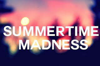
I feel the font 'SUMMERTIME MADNESS' in the image above is a good way to express the title. The font is bold and by the use of capital letters it emphases the strong atmosphere that festivals have. The use of the color white against the blurred background makes the title readable yet fun, the title blends into the image which relates to the idea of being 'lost in a crowd'. I feel the example of the title above could be good strong title to have on the front of my magazine as i feel it has an atmospheric effect that will relate to my audience.
Flowers and Fest.
This title promotes the magazine as a fun time girly magazine This relates to my target audience as they will be girls ages 17-25 who go to festivals. The word 'Flowers' promotes the girly side of the magazine, flowers are soft and create a feminine atmosphere. My target audience will be girly festival ladies and will want a music magazine that promotes fashion along side artist promotion. The word 'and fest' shows that the magazine is about festivals and its relates to the word flowers. The magazine will promote fashion through the use of 'flower' but also promotes the music side of the magazine but the use of the word fest. Therefore i feel this title works well to promote festivals to girls.

The soft gentle flowers will promote a warm inviting feeling to the introduction of the magazine, if the title links to flowers it could create a theme for throughout the magazine. The title font used for this title 'Flowers and Fest' would need to contrast, the word Flowers would be in italics 'Flowers' to create the soft warm feeling inviting the reader into the magazine and word fest would need to stand out to emphasis the meaning of the music magazine and relate to the theme. The word fest would need to be bold and use of capital letters would make words contrast against one another 'FEST'.
SHOUT.
The title here is simple yet to the point. For this one i wanted to create a title that's bold yet effective. This title will be what the target audience want as its direct and easy for young adults to read. The title creates a buzz to the magazine giving off the festival atmosphere. The word 'shout' relates directly to festivals as shouting is pronounced often at festivals, the word shout would be in a clear font to inform the readers of the theme and what the magazine has to offer.

The image here it shown in a funky font. The font shows how atmospheric the magazine is and creates an effect that the target audience wants to read. The image of the mouth on the center of the 'O' creates a different effect to the others making the title stand out.
Friday, 18 October 2013

Monday, 14 October 2013

Feature Article- Exploring Festival Magazines.

The magazines above are all festival and music related. The magazines are linked with the music industry therefore i can identity the key features the magazines contain, to get an idea of what ill need to put into my magazine to make it effective.
Title- The magazines all have a clear bold confident title on there front cover, this may have been done to shout out to the target audience. This relates to how music is loud and very out there.
Subheading- Two of the magazines contain subheadings. The magazine on the bottom right 'woodstock' has the subheading 'music festival' this is effective as its straight to the point. The magazine 'muse' on the top left also contains the subheading 'Glastonbury review 2010' this subheading is showing an example of what the magazine contains.
Color scheme- All of the magazines contain a similar color scheme. The colors used are blue, yellow, red and green this indicates that the magazine may be aimed at both sexes.
Magazine names- The magazines have sharp one word names. This is to show determination between magazines.
Pictures- The images are all centrail they create a atmosphere for the magazine. The images of people within the magazine are shown in twos.
Monday, 7 October 2013
Feature artice, Analyzie Two.
The front covers design is
very similar to Q’s content page as they use the same font and colour
scheme, therefore it shows the reader that they are almost carrying on the
front cover into the music magazine, so that it all flows, and is an easy
enjoyable read. The overall design is very basic and not to garish, this
shows that the music magazine is not trying to show itself off, this could
suggest that it is already a very well-known magazine, in the music world.
The bold red at the top of the page displaying the pages tittle, stands out
against the plain white background and this makes it look very professional
and a well-made magazine. The layout
of the content page is very simple and easy to navigate around, therefore
the reader does not need to take too long on the content page routing
around to find the article they are looking for.
|
The main purpose of
a content page is to show the reader who else major is being featured in
the magazine, as otherwise they might just simply skim through to the where
the article they want to read is and not know about the other big bands
being featured. It is also to give the reader some a short piece of info
that they might not of known before looking at the magazine, also some
magazines have small captions of an article that is of something major but
only show the rest online, this technique can draw a bigger audience into
their online magazine, therefore they have a wider costumer base to sell
their magazine to. However Q does not do this.
|
The magazine itself uses many
different persuasive techniques to draw the audience into physically
reading the articles, presented on the content page e.g. the use of
different colourations, for the numbers and tittles of each artist, the
major artists that have been featured, have their names in a red, whereas
the rest have their names in orange this shows that the ones in red have
been featured on the front cover of the magazine, letting the reader know
there are bigger articles about that band. They also use captions from that
article, so that the reader has a small slice of what the article is about
and may want to read into it more. On the right hand side they have a
‘Reviews’ section which they make stand out giving it a separate box, this
could suggest that these are important and a good read. The images that
they have used are all of artists/ band together therefore showing that the
articles featured might be about all of them, this would further entice the
reader into wanting to know about how the whole band is getting on.
|
There are many artists that have been displayed and
featured on the content page, with little sub-quotes, for each caption to
go with the name of the artist. This is so that the reader can
automatically know where and what that particular article is about, and
what it focuses on about that artist. The page numbers are displayed in
bold black so that they are the first thing that the reader notices, when looking
at the featured artists. There are exactly 17 artists displayed on the
content page which is a lot of information to take in when quickly skimming
through trying to find the article you are looking for but they have mad
the main articles closer to the top e.g. Kings of Leon.
|
Sunday, 6 October 2013

Saturday, 5 October 2013

Monday, 16 September 2013
Analysing Problem page.
Analyzing problem page.
I designed my problem page for the age group 15-19. I used a bright color scheme to emphasis the fun of the magazine and i used the schools color theme so the page linked in with the school personally. I used two images in my magazine the main image of the agony aunt is central but has an oval shape for effect and my second image of exam results to link to context. There was a variety of software used to complete my problem page, i started off by using word Microsoft office for the basic background colours, shape and figures. Procured the images and pasted them onto my background image using an on line editor 'lunapic' to add the finishing touches i then processed the image back onto work to add text to the final outcome. I felt the color scheme would give the magazine an inviting look and something interesting and fun that a student would want to read. Overall i feel my magazine page was successful as it promotes fun and interesting facts about how to deal with exams. If i had chance to redo my magazine i would change the layout of the page, this would improve the page by making the writing easier to read and the page look less busy, i would also share the magazine with the younger years as everyone has to undergo exams, therefore i would change my target audience t to 14-19 year olds as i feel because of the fun colors it would attract more young attention as well as being useful for the older age range.
Friday, 13 September 2013
.jpeg)
Planning of Magazine.
Problem page for a sixform Magazine.
Target audience: The target audience for this article will be 16-18 year old sixform students. The article will have to take into consideration students interests and hobbies if the article is successful it will need to be exciting and interesting for students. The magazine will need to research into different gender interests and personalities to fill the problem page with interesting story's that the students can relate too.
Magazines Name: Due to the fact the target audience is old teenagers the magazine will need to have a bold effective title that stands out against other magazines. My thoughts on the title is to make it as bright and as clear as possible. The name needs to be catching and maybe by interpreting humour into the title it will give it an effective outcome.
List of magazine names-
My Brain 'The funniest exam magazine to date'
Student Life ' How to be the perfect student'
Sixform Herald
 Slogan: The sixform magazine is aimed at the students of the downs specifically therefore the slogan should be the downs school logo as my magazine is not aimed at students as a whole.
Colour scheme: By interpreting the school logo colours it relates the slogan to context. The colours yellow and red could be interpreted as clown colours therefore would make the magazine look fun, Due to the colour being bright it would draw the viewers eyes to the magazine the yellow interpreted into the theme is seen as an inviting warm colour making the viewer feel comfort by the magazine. The house style colours will continue throughout the magazine.
Font: The font in my magazine will need to link in with the house style of fun. The font needs to be clear and effective below are some fonts i feel will relate to my magazine.
Fonts
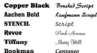
The fonts important throughout your magazine so therefore needs to chosen with precision.
Target audience: The target audience for this article will be 16-18 year old sixform students. The article will have to take into consideration students interests and hobbies if the article is successful it will need to be exciting and interesting for students. The magazine will need to research into different gender interests and personalities to fill the problem page with interesting story's that the students can relate too.
Magazines Name: Due to the fact the target audience is old teenagers the magazine will need to have a bold effective title that stands out against other magazines. My thoughts on the title is to make it as bright and as clear as possible. The name needs to be catching and maybe by interpreting humour into the title it will give it an effective outcome.
List of magazine names-
My Brain 'The funniest exam magazine to date'
Student Life ' How to be the perfect student'
Sixform Herald
Slogan: The sixform magazine is aimed at the students of the downs specifically therefore the slogan should be the downs school logo as my magazine is not aimed at students as a whole.Colour scheme: By interpreting the school logo colours it relates the slogan to context. The colours yellow and red could be interpreted as clown colours therefore would make the magazine look fun, Due to the colour being bright it would draw the viewers eyes to the magazine the yellow interpreted into the theme is seen as an inviting warm colour making the viewer feel comfort by the magazine. The house style colours will continue throughout the magazine.
Font: The font in my magazine will need to link in with the house style of fun. The font needs to be clear and effective below are some fonts i feel will relate to my magazine.
Fonts

The fonts important throughout your magazine so therefore needs to chosen with precision.
Monday, 9 September 2013

Review on conventions and style features of three problem pages.
AS Media- Preliminary Project. 09.09.2013
- The three magazines are all aimed at females this is shown in the style feature by use of the colour pink making the magazines appear feminine. The use of soft colours gives the magazines a warm and inviting effect, making them appear comforting almost as if the reader can feel comfort by the magazine inviting the target audience of females to buy the magazine.
- Another style feature the magazines have in common is the fact they all pursue an italics type master head this will attract female attention as it is seen as feminine.Italics also stands out against other fonts.
- A convention the magazines share is use of light colour schemes mainly pale pinks and blues.
- Additionally the magazines all contain a central image.
- All magazines share a connections and link in with an guidance page this is commonly known as an 'agony aunt'
- The magazines have good use of subheadings and quotes, this is used to draw attention of the target audience making them want to read the article/story.
- The layout of the pages are focused on box's and borders making the articles look indepth and interesting.
- The use of drop caps within the magazines create an engaging effect.
- Another style feature the magazines all pursue is use of additional images that relate to the article.
Subscribe to:
Comments (Atom)